Daniel Fexa / Portfolio
Tier 1 Energy Solutions Brand Identity
A ground-up oilfield-services brand spanning strategy, logo design, vehicle wraps, and marketing materials.
Explore case studyThe Company
Tier 1 Energy Solutions is a Western Canadian oilfield-services company offering Cased Hole Wireline, Completions, Liner Hanger, and Thru Tubing services. Its launch footprint included Grande Prairie, Leduc, Edmonton, and Lloydminster.
The business positioned itself as a solutions-focused, technically advanced operator with an environmentally conscious outlook. It needed a brand credible in sales conversations and recognizable on equipment in the field.
The Project
The company had a name and a vision, but no established visual identity. It needed a scalable brand system capable of competing with established oilfield-services providers from its first day in market.
Approach & Delivery
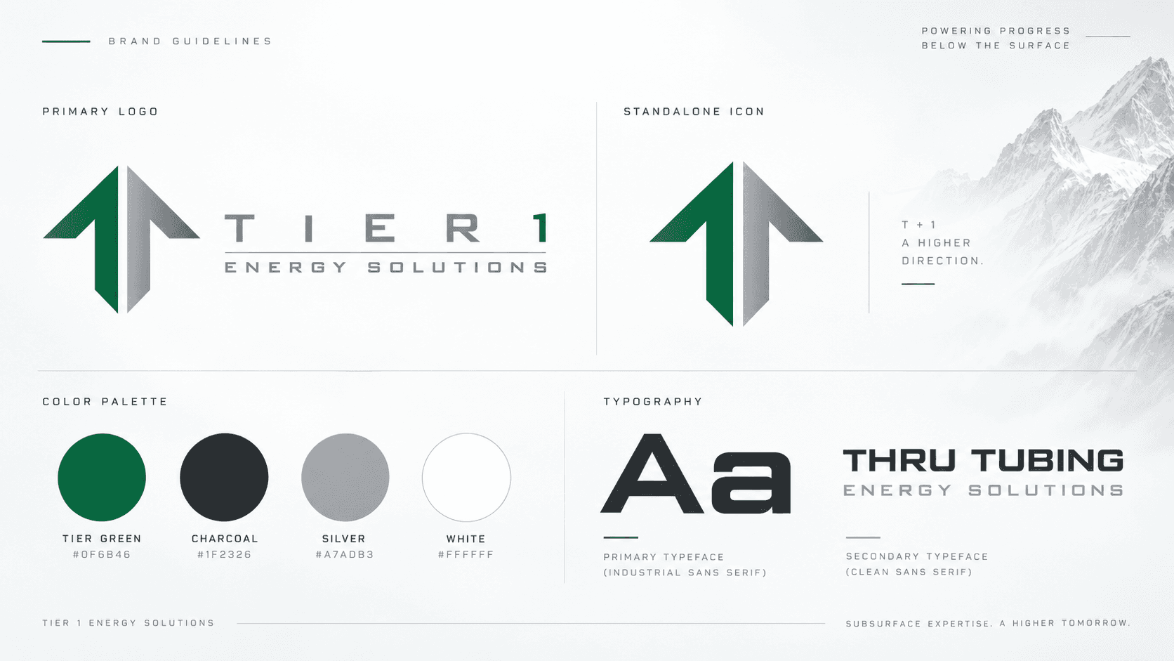
I developed the brand strategy and visual identity around a disciplined green-and-silver palette and an upward-arrow mark. The identity was designed to work across vehicle wraps, rigs, offices, service sheets, and client-facing materials.
I carried the system through logo variations, typography, field-ready graphics, marketing collateral, and brand guidelines so that each touchpoint communicated the same business positioning.
Deliverables
- Brand strategy
- Logo and visual identity
- Vehicle wraps
- Marketing materials
- Service sheets
- Brand guidelines
Results
The brand launched across four Western Canadian operating regions, with aligned vehicle graphics, field collateral, and a marketing suite ready for sales conversations.